Notice how some people light up at the sight of a soft pastel pink while others swear by jet black or electric blue? It’s just absolutely wild how something as simple as color can say so much about who we are. Our mood, our vibe, and yes, even our favorite colors by gender tell their own story. Now before you roll your eyes and say, “Oh great, more talk about pink for girls and blue for guys,” hold up, this isn’t that kind of conversation!
We’re digging deeper here. Because color preferences aren’t just random or old-school stereotypes. We’re talking psychology, culture, personal taste, and even how the world shapes what we see. Let’s be real, from the coffee mug you grab in the morning to the brand logos that stalk your feed, color choices sneak into pretty much every decision we make, right?
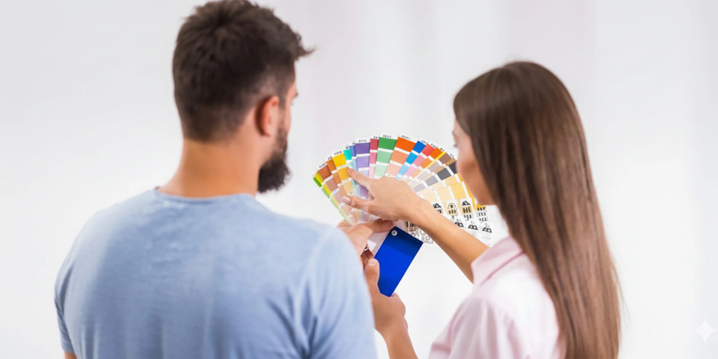
So, if you’re a brand figuring out which colors speak to your audience or just wondering why your partner loves olive green, you’re in for a ride.
Color Preferences by Gender: An Overview
Let’s take a quick step back. When people ask about favorite colors by genders, they usually want the same old answer: “Boys like blue and girls like pink” Well… sort of. Patterns exist, sure. But they’re messy, overlap a ton, and change depending on age, culture, personality, and trends.
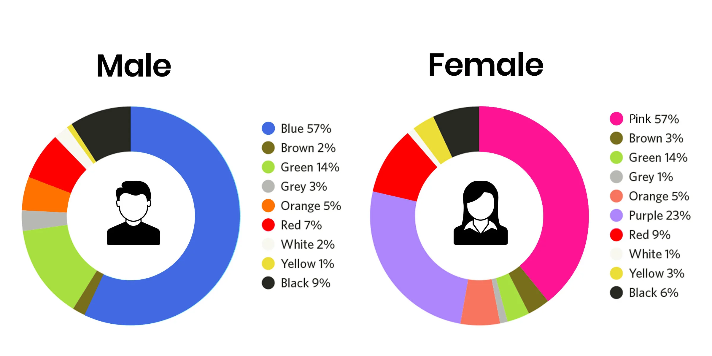
So, what now? Is that just marketing talk gone too far? Turns out, it’s a bit of both. Research shows that there are certain patterns in gender color differences, but it’s not always what you’d expect. Blue, for example, tends to be the top pick for both sexes, yes, both. Still, you get nuances. Men, more or less, like bold and darker shades, while women favor softer and lighter tones.
Here’s what’s really going down:
- Biology plays a part. Women have slightly better color perception on average, which makes them more drawn to subtle color variations. Those “is it lavender or lilac?” debates make total sense now, don’t they?
- Men prefer simplicity. Studies on male vs. female color perception show men usually stick to primary or straightforward hues (like “blue” instead of “navy” or “cerulean”).
- Culture matters. From childhood, we’re kind of nudged toward specific color cues. Toy packaging, clothing, and even advertising help shape what becomes our “comfort zone” of colors.
- Psychology ties it together. Some colors just feel a certain way. Blue feels calm, red feels powerful, pink feels playful, and those associations stick with us.
So, when you put it all together, you start seeing three themes repeated: biology (maybe), culture (definitely), and trends (always).
Let’s talk through it.
Popular Colors Among Women
When it comes to women’s favorite color choices, yeah, blues, purples, and pinks always steal the show. But hey, not in that super girly, bubblegum cliché kind of way you’re probably thinking.
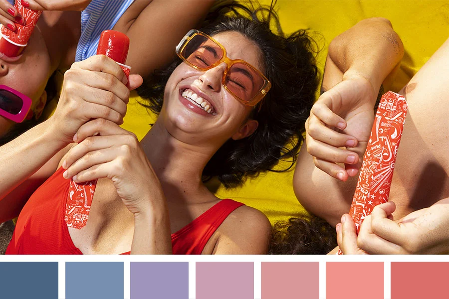
- Blue often wins because it feels calm and dependable. It’s soothing. Kind of like that favorite hoodie you refuse to throw away.
- Purple or violet tones carries that mix of creativity and luxury (because who doesn’t want a little royalty energy?).
- Pink (from blush tones to hot magenta) still holds its own as the ultimate “feel-good” shade for many.
Why these? Because colors that reflect warmth, empathy, and creativity tend to rank higher for women (maybe because they’re wired to connect through feeling and meaning.)
Popular Colors Among Men
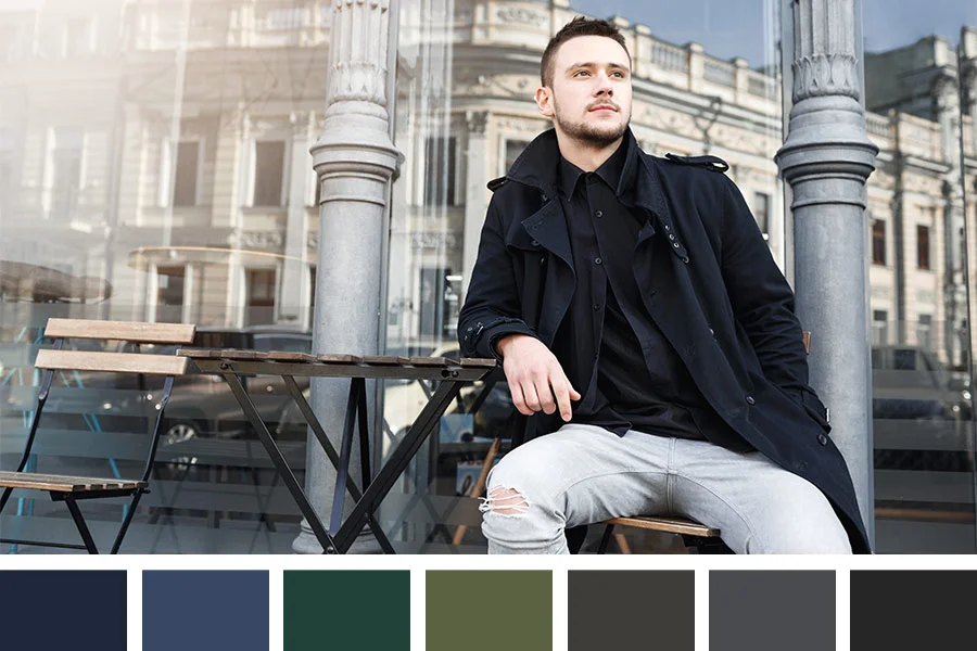
Now, when it comes to men’s favorite colors, they aren’t “boring,” but often more muted or deeper shades that read dependable and rugged. Bright neons can work for specific niches (sports, youth brands), but in general, guys tend to favor colors that feel grounded.
You can use these same rays to fade a shirt. To make it even quicker, you need to apply lemon juice. Lemon juice has citric acid that unties the chemical bonds of the color and fabric of your shirt. The combination results in quick fading that looks natural too, and without damaging the shirt.
Here is how to make a shirt look faded with lemon juice and sunlight.
- Blue still reigns supreme (no surprise there); screams confidence, loyalty, and stability.
- Green often follows because it feels natural, fresh, and balanced.
- Black is the ultimate “best” color because it’s sleek, strong, and just plain effortless.
Most men like colors that communicate power or the “less is more” mindset. That’s why, when brands study male vs. female colors, you’ll see men’s products wrapped in darker tones while women’s lean lighter and softer.
How Age Affects Color Preferences by Gender?
Here’s something you should know: your favorite color in your 20s might not be your favorite color in your 50s. Yes, our tastes grow with us too.
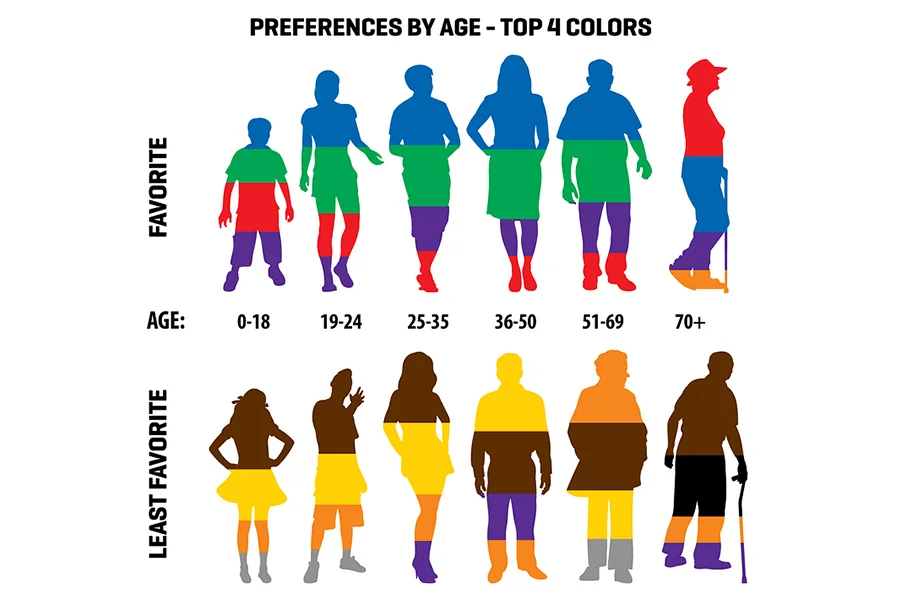
- Young women go for punchy, high-energy shades like hot pink or teal. But, of course, with age, many switch to classy, muted tones like navy or mauve.
- Men? When they’re younger, they experiment more, bright colors, flashy stuff, but give it a few years, and suddenly it’s all about those calm neutrals. Gray everything. Literally.
Age changes how we feel about color. The more life experience we have, the more we value calmness over chaos, hence, the shift to stable tones.
Cultural Impact on Gender Color Preferences
Culture messes with color more than we realize. In some places, color gendering is intense. Pinks and pastels are for girls and specific tones like blues are for boys. Others don’t get “pink for girls, blue for boys” memo. For them, colors just… are. History, religion, and tradition shape what they mean, and it’s completely different across the world.
What’s seen as the favorite gender color norms in the West might not match in Asia, Africa, or the Middle East. For instance, in Japan, men wear pink with pride but in the U.S it will unfairly label a man as gay or fruity. In India, red symbolizes prosperity and is loved across genders while in South Africa it’s a color of mourning.
Gender color differences can completely flip depending on where you’re standing on the map. So, don’t assume your home-country palette works everywhere.
The Psychology Behind Pink and Blue
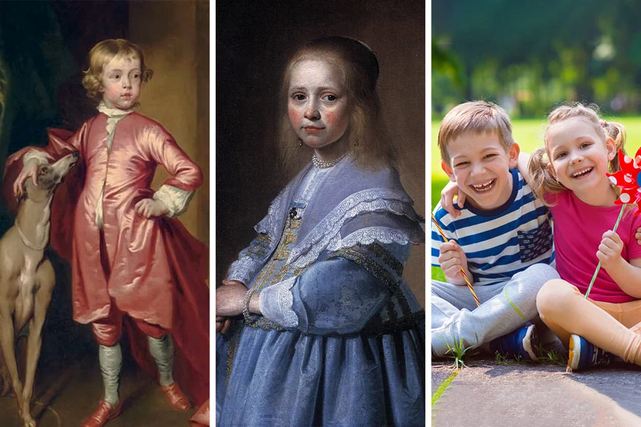
Let’s talk about a color debate that’s been around for decades: pink vs. blue. Why do we instantly associate them with gender?
Interestingly, it wasn’t always this way. Back in the early 1900s, pink was considered bold and masculine (since it’s a lighter shade of red), while blue was thought to be delicate, feminine and “perfect for girls.”
But after World War II, marketing trends flipped the script. Blue became the color for boys, pink for girls, and the rest is history.
Today, those old color rules are fading fast. Pink’s a power color in men’s fashion, and blue’s a universal favorite across industries.
How to Choose Colors Based on Gender Preferences?
We’ve talked about why colors matter, so let’s get into how to actually use them.
If you’re choosing shades for your brand, your store, or even your workspace, understanding how different audiences respond to colors helps you make smarter and more meaningful choices.
Here’s a simple rule: don’t pick a color just because it’s trending on Pinterest. Think about who you want to attract and why they’d connect with it. The goal is to choose colors that create emotion and connection, not just look good.
This what you should consider before finalizing your color palette:
- Audience matters: Who’s this really for: Young professionals, families, or teenagers? A palette that clicks with a woman in her 20s probably won’t hit the same for a man in his 50s.
- Purpose matters: A gym logo and a skincare brand need very different color schemes.
- Trends change: What’s popular today might feel outdated tomorrow. Choose colors that represent your brand for the long run.
In the end, go for colors that feel right for your story and audience, not just what’s popular online.
Gender-Neutral Colors and Trends
There are lots of colors that don’t feel overly “male” or “female.” Green, yellow, orange, and many earth tones sit free of heavy gender associations, making them great for neutral and inclusive designs.
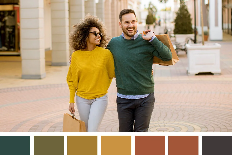
Minimalism in, sustainability is shaping brand identity, and a touch of nostalgia is back in style. It’s no surprise that tones like olive, mustard, and terracotta are becoming favorites. They simply work for everyone.
Today’s audiences are moving away from gender-based color stereotypes, and brands are taking note. Many are shifting toward neutral palettes with a subtle accent color, moving past the old “pink for girls, blue for boys” idea.
Unisex fashion, neutral packaging, and inclusive branding aren’t passing trends, they’re part of how modern brands connect with wider audiences.
Color Preferences in Marketing by Gender
Marketers understand the power of color psychology. They know attractive colors for men and women and how those shades influence emotions and buying behavior. When a brand targets men, you’ll often see bold, darker tones that convey strength and confidence. For women, it’s usually softer shades or rich, elegant tones that create a sense of warmth and sophistication.
The most effective brands today find balance between both. Look at Apple or Nike, their clean, simple, and universal style appeals to everyone. They’ve got that “for all” energy down that feels inclusive and timeless.
Seasonal and Fashion Color Trends by Gender
Fashion and seasons change everything. Men might go darker in winter (navy, maroon, charcoal) and lighter in summer (white, khaki, sage). Women? They’re more flexible. Soft pastels in spring, bold jewel tones in fall. They treat color like an accessory to the mood, not just the weather.
The truth is, color trends are temporary, but taste is totally personal. People evolve, styles evolve, and that’s what keeps things exciting. What felt “too bright” last year might suddenly feel so you this year. That’s the fun part about color that it’s never static.
For brands, this means don’t just follow the runway reports but watch what’s happening in real life. Street style, social media buzz, and seasonal merch drop are great way to test what folks actually want and attract repeat customers who love fresh drops.
Impact of Personality on Color Preferences by Gender
Let’s be honest. Personality often matters more than gender. The colors people prefer usually reflect who they are, not which category they fit into.
- Love red? You’re bold and confident.
- Prefer blue? You’re calm and dependable.
- Drawn to black? You value control, strength, and a touch of mystery.
Even though research shows some male vs. female color perception differences, personality usually has the final say. It doesn’t really matter if a man likes lilac or a woman prefers gray. What matters is offering personality-driven choices instead of limiting them to “for him” or “for her.” That’s how real connections happen.
Future Trends: Are Gender Color Preferences Changing?
Short answer: yes. The lines are blurring. The new generation doesn’t care what color “belongs” to who. They’ll wear pink, teal, or lime green if it feels like them. No rules, just pure mood. Brands finally got the memo, too. Everything’s going gender-neutral, from packaging to full-on product lines. It’s less “his and hers” now and more “whoever feels it.”
With tech, sustainability, and pop culture pushing things forward, color’s getting personal. People aren’t picking shades from gender charts anymore but based on mood, values, and context.
The future? More choice, more mixing, and less boxed-in thinking. And honestly, it’s about time.
How to Use This Info for Brands, Designers, or Your Custom projects?
- Segment, don’t assume. Everyone’s different. Use data and test.
- Offer choices. For products, provide a couple of gendered and several gender-neutral colorways.
- Use accents wisely. A neutral base + a pop color often beats an all-out bold palette.
- Test locally. Color meanings vary; do small market tests before big production runs.
- Stay current. Seasonal palettes and trend reports matter for fashion and retail.
- Respect personality. Offer options for both loud and quiet personalities.
Frequently Asked Questions
Conclusion
Colors tell your story. Be it your brand pallete, picking your outfit, or just figuring out why you love that one hoodie shade (don’t worry, we all have a color phase), it’s all about connection.
At the end of the day, color is all about you. Wear what feels right and roll with it. Color’s not supposed to be serious but fun, expressive, and a little all over the place… like life, right?
So, mix it up, mess around, and wear whatever you like. Because honestly? The best color for you isn’t on a chart. It’s the one that feels most you.


